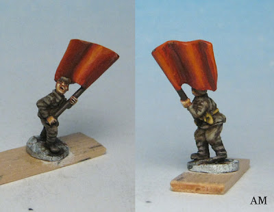
Red is a pain to work with, everyone knows it. Transparent, lousy coverage, generally hard to make it look the way you want. I generally use a warm primary (GW Blood Red) for most red things, but for the Fourth Doctor's burgundy-ish jacket I chose a cooler crimson. I used this random Mage Knight mini as a test piece to try and work out the troublesome red highlighting issue, and hopefully learn something:

Left side: Games Workshop Crimson Gore/Scorched Brown base coat, shaded with Scorched Brown, highlighted up with mixtures of C.G/yellow. A
very warm result.
Center: Games Workshop Crimson Gore/Scorched Brown base coat, shaded with Scorched Brown, highlighted up with mixtures of C.G/white. This gave me the pink highlights that people tend to try and avoid.
Right side: Games Workshop Crimson Gore/Scorched Brown base coat, shaded with Scorched Brown, highlighted up with mixtures of C.G/Bleached Bone. The result is slightly less pink than mixing with white.
I'm not sure either look is particularly satisfying, but as always, this is a learning experience. And... this isn't for the Golden Demons or anything. I just want my growing Doctor collection to look pretty good :)


